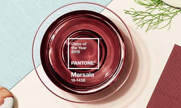
Ever since 1990, Pantone Color Institute has selected a Color of the Year that directs the sails of designers and consumers around the world. Its purpose is to predict what color consumers will be buying and wearing for the following year. However, the color for 2015 isn’t one to necessarily fawn over. At the opening of the year, Pantone announced the color of the year to be… Marsala. Hold your applause.
Marsala is an earthy red tone, much like the wine that inspires the color. Pantone stated that “this tasteful hue embodies the satisfying richness of a fulfilling meal, while its grounding red-brown roots emanate a sophisticated, natural earthiness.” Sounds pretty appealing, right? However, since the release of the 2015 Color of the Year, fashion magazine reporters, bloggers, and every day people have been tearing the color down from its pedestal.
Some say that Marsala looks more like rust or dried blood, than an enriching, earthy, and tasteful color (according to the Atlantic). It gives off a much different vibe than the 2014 color, Radiant Orchid, which was bright, cheery, and inspiring. Perhaps the Pantone sail hit a strong, colorless wind in the wrong direction? Thankfully, there are a few ways this drab color can be revived without looking too rustic…literally.
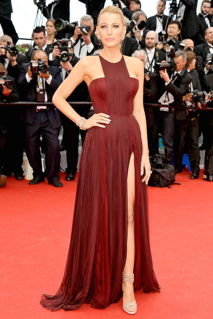
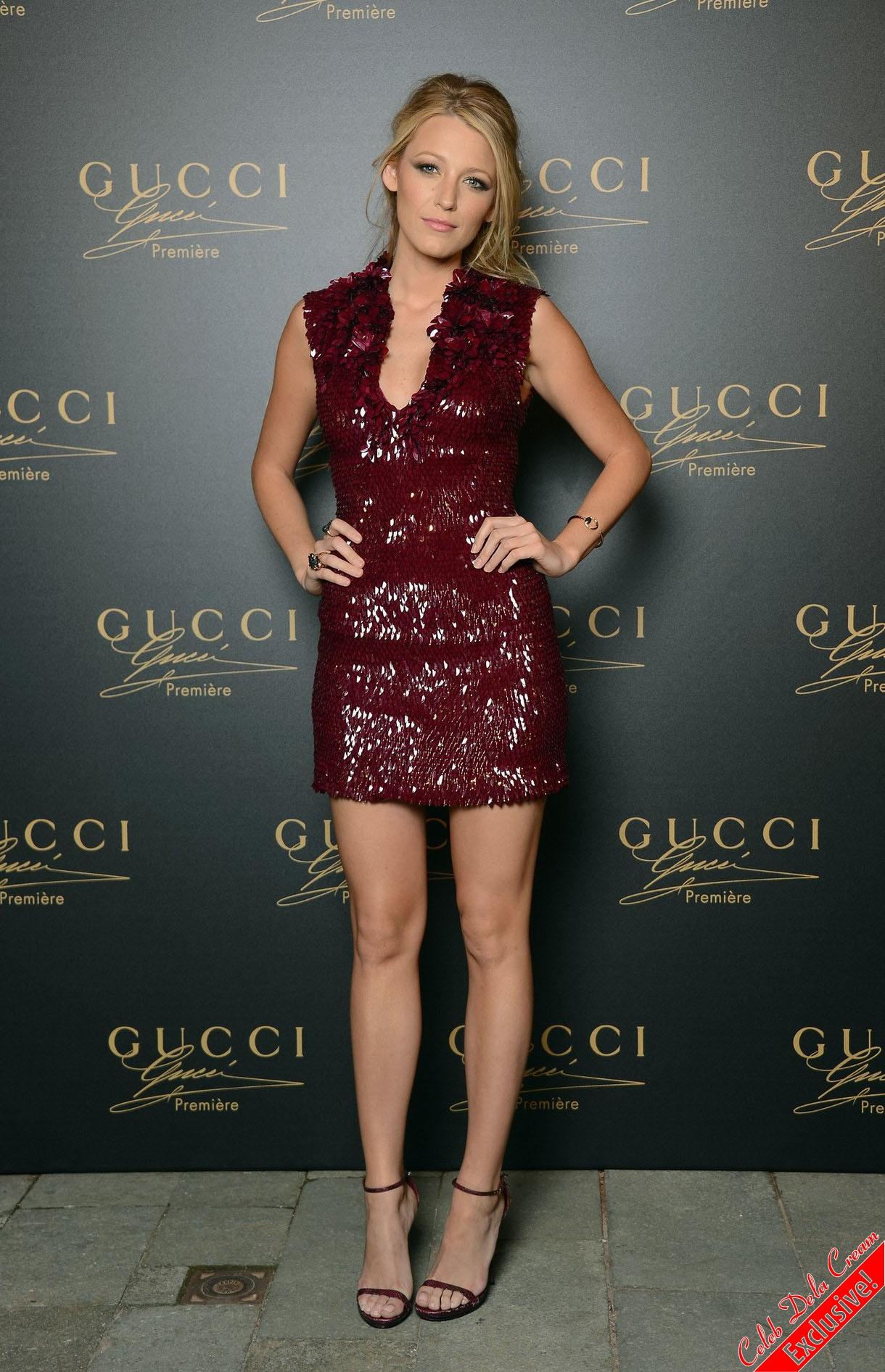
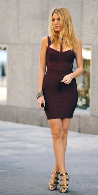
One celebrity who has stood out in “Marsala” colored frocks in the past was none other than goddess, Blake Lively (see below). Lively embodied the color and found the perfect shade to match her golden bronzed skin tone, blowing her fan base completely away (as usual). If Marsala still isn’t your color of choice, there is also a more extensive list of trending colors for 2015.
The rest of the list was, fortunately, set in the right direction for the year. Pantone took a spin on usual bright colors that appear in the fashion world and made them more subdued. 2015 is all about faded tones that could make for a pretty prom dress as the season approaches, including Aquamarine, Classic blue, Tangerine, and pasty pink color known as Strawberry Ice. All these colors should be paired with a metallic accessory or shoe to make the look pop, and even a little glitz so as to drown the drab.
The more popular color that appears on the Pantone color scale seems not to be the earthy red they predicted, but cool, soft blues. These blues are much easier to pull off and, in my opinion, a lot prettier. If you aren’t into the Marsala trend, try opting for a soft blue instead.